UI Widget Builder
PSD Exporter — Field Guide
This guide explains how the current JSX exporter reads Photoshop layer names, what each layer-name prefix produces inside Unreal, and the toolbar utilities that help you prepare a PSD before exporting. It has been refreshed against the actual UI_Widget_Builder__PhotoshopExporter.jsx behavior.
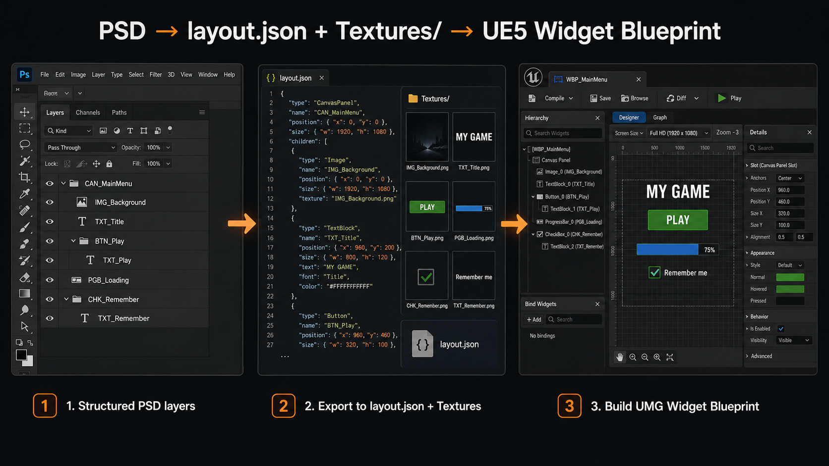
Pipeline overview
The exporter never edits your source PSD. It walks the layer tree, exports PNGs for
anything that needs to be a texture, and writes a single layout.json
describing the widget tree, positions, styling and interactions. The Unreal importer
reads that JSON and builds real UMG Widget Blueprints from it.
Recommended order of operations
-
1
Name your layers and groups using the prefixes in this guide. Group folders become containers; art layers and text layers become widgets or images.
-
2
Run “Prep Layers” to catch any text or image layers you forgot to prefix.
-
3
Run “Fill States” on any BTN_ groups that are missing Hover/Pressed art.
-
4
Choose an export folder, set your Export Options, and click Export PSD.
-
5
Check the export summary and warnings. The completion alert shows counts and the first warning; the full warnings array is written into
layout.json. -
6
Import
layout.jsonwith the UI Widget Builder importer inside Unreal.
Current JSX behavior snapshot
| Area | Current behavior |
|---|---|
| Output structure | Writes layout.json with document, groups, layers, features and warnings, plus PNGs in Textures/. |
| Visibility | Hidden layers and hidden groups are skipped during traversal. The UI still shows a “Skip invisible layers” checkbox, but the current JSX always skips invisible items. |
| Z order | Photoshop’s topmost visible layer gets the highest CanvasPanel ZOrder. Box-style containers use slot order instead of free Canvas positioning. |
| Progress | The export progress window has a Cancel button. Cancelling stops after the current texture operation and may leave partial output on disk. |
| Solid-color optimization | When enabled, only safe rectangular flat-color art is reduced to 64×64. Rounded corners, masks, transparent edges, and layer effects are exported full-size to preserve the visible shape. |
| Text wrap metadata | Text layers export bounds, line-height, and wrap fields. The Unreal importer can also infer wrapped/multiline text from the exported text box height when Photoshop does not mark the layer as area text. |
Core widget prefixes
These prefixes can be used on either an art layer or a group (folder). A group with one of these prefixes becomes the named widget and its contents become that widget's parts; a flat layer becomes the widget directly where that makes sense.
| Prefix | Widget produced | Notes |
|---|---|---|
| BTN_ | Button | Group preferred. A flat BTN_ art layer is a transform placeholder only — it never exports its own texture. |
| TXT_ / LABEL_ | TextBlock | Must be a real Photoshop text layer. Font, size, color, alignment, tracking, leading, caps, italic/faux italic, auto-wrap, drop shadow and RTL direction are read automatically. |
| IMG_ / BG_ / ICO_ | Image | Generic image layers. PNL_ also renders as a 9-slice Box instead of a plain image. |
| SLD_ | Slider | Needs a BAR_ (track) and THM_ (thumb) child. Default value is computed from their positions. |
| RSLD_ / RSL_ / RADSLD_ | RadialSlider | Needs a BAR_ (size reference, invisible in output) and RTHM_ (radial thumb). |
| CHK_ / TGL_ | CheckBox / ToggleButton | TGL_ sets checkboxType = ToggleButton. Optional BOX_, CHKMARK_, TXT_/LABEL_ children. |
| CHKG_ | CanvasPanel + group metadata | Exclusive checkbox group. First child becomes the default checked item on import; text labels inside the group are made non-hit-testable. See notice below. |
| TXI_ / TXIM_ | EditableText / MultiLineEditableText | No box chrome. The layer's own text becomes the placeholder. |
| ETB_ / ETBM_ / ETM_ | EditableTextBox / MultiLineEditableTextBox | Has box chrome — add a BG_ child for the input background. The importer applies the BG brush to normal, hovered, focused, and read-only states and reads the placeholder TXT child font. |
| CMB_ | ComboBoxString | Optional BG_, ARW_, TXT_ (selected text) children. |
| OPT_ | TextBlock (combo option) | Use inside a CMB_ group to define dropdown entries. |
| SPN_ | SpinBox | Min 0, Max 100, Step 1 by default — adjust in the importer or Blueprint afterward. |
| PGB_ | ProgressBar | Use BG_ for the track and FILL_ for the progress fill. A BAR_ child inside PGB_ is also treated as a progress fill role. |
Containers & layout
These prefixes only apply to group folders. They define how the children of that folder get arranged — by exact PSD position, in a row/column, in a grid, or as switchable pages.
| Prefix | Widget produced | Notes |
|---|---|---|
| CAN_ | CanvasPanel (screen) | Marks a top-level screen / page. See notice below about automatic SafeZone + ScaleBox wrapping. |
| HBX_ / VBX_ | HorizontalBox / VerticalBox | Children are exported in slot order and receive Fill/Auto slot metadata. Fill ratios are computed from child width for HBX_ and child height for VBX_. |
| WBX_ | WrapBox | Wraps children left-to-right; wrap width comes from the folder's bounds. |
| UGP_ | UniformGridPanel | Cell size is derived from the largest child. Supports the column/row syntax. |
| GRD_ / GDP_ / GPN_ | GridPanel | Slots are computed from each child's PSD position. Supports the column/row syntax. |
| LSV_ / LST_ | ListView | Can be an empty placeholder layer/folder — the importer creates the ListView shell. |
| TLV_ / TIL_ | TileView | Same as ListView, with a default 128×128 tile entry size. |
| TRV_ / TVW_ | TreeView | Empty placeholder is allowed. |
| WSW_ / WIS_ | WidgetSwitcher | Each child folder becomes a page. See the auto-detection notice — you don't always need this prefix. |
| SCB_ / SCR_ | ScrollBox | Vertical by default. Add H_/V_ for orientation and S_ for a fixed viewport — see syntax. |
| OVL_ / OLY_ | Overlay | All children fill the overlay and stack in PSD order. |
| SFZ_ / SAFE_ | SafeZone | Single-child wrapper, used automatically for CAN_ screens too. |
| SCX_ / SCL_ / SBX_ | ScaleBox | Single-child wrapper, default ScaleToFit, both directions. |
| SZB_ / SIZE_ | SizeBox | Override width/height come directly from the folder's PSD bounds. |
| STB_ / STK_ | StackBox | Vertical by default; add H_ / V_ for orientation. |
| BDR_ | Border | Single-child wrapper with a border image. |
| PNL_ / BG_ / GRP_ | Panel / CanvasPanel | Generic grouping — children keep their exact PSD positions. A BG_ folder is a panel; a BG_ art layer is an image/background. |
| SPS_ | Spacer | See the size syntax below. |
Compound widget parts
These prefixes are used on children inside a widget group — they don't become their own widget. Instead they're consumed as the brushes/images that make up the parent widget's appearance. The role each one plays depends on what kind of parent it sits inside.
| Prefix | Role | Used inside |
|---|---|---|
| FILL_ | Fill image | PGB_ (progress fill) or generic fill |
| BAR_ | Track / size reference | SLD_ (track or fill if its name includes fill/value/progress), RSLD_ (size only — not drawn), SCB_ (scroll bar), PGB_ (progress fill) |
| THM_ | Thumb | SLD_ (slider thumb) or SCB_ (scroll thumb) |
| RTHM_ | Radial thumb | RSLD_ |
| BOX_ | Unchecked box image | CHK_ / TGL_ |
| CHKMARK_ | Checked image | CHK_ / TGL_ |
| TXT_ / LABEL_ | Contextual label | Checkbox label, slider label, placeholder text, combo selected text, spin value text, progress label — depends on the parent |
| BG_ | Background image | ETB_ / ETBM_ / CMB_ / SPN_ / PGB_ / BDR_ |
| ARW_ | Dropdown arrow | CMB_ |
| OPTBG_ | Generic image (no special role yet) | Reserved for future combo-option backgrounds — currently exported as a plain image part. |
A flat BTN_ layer placed inside another BTN_ group is treated purely as Photoshop backplate art — it's never exported as a nested Button.
Button states & actions
Inside a BTN_ group, the exporter looks for state art and for a small set of reserved action names.
State art — two equivalent styles
| Style | Example | Notes |
|---|---|---|
| Flat layer | IMG_Normal, IMG_Hover, IMG_Pressed, IMG_Disabled |
Simplest — one art layer per state, directly inside the BTN_ group. |
| Group | STATE_normal, STATE_hovered, STATE_pressed, STATE_disabled |
The whole folder is flattened to one PNG for that state — use when a state needs more than one layer (e.g. art + glow + label). |
Recognised words: normal/idle/default, hover/hovered/focus/focused, press/pressed/click/clicked/down, disabled/disable/inactive.
The Fill States toolbar creates only the three canonical flat layers IMG_Normal, IMG_Hover and IMG_Pressed; it does not create IMG_Disabled.
Reserved button names & smart targeting
| Name / pattern | Behaviour |
|---|---|
| BTN_Close | Closes (hides) its own parent container. Reserved — don't reuse this name for anything else. |
| BTN_Exit | Exports an "exit" action placeholder for your game-side Blueprint to hook into. Also reserved. |
| Matching name elsewhere | If a BTN_Something button's name (minus prefix) matches another group's name, that button gets a "toggleVisibility" action targeting that group. |
| Matching name inside a WSW_ | If the matched group is a direct child of a WSW_/WIS_ WidgetSwitcher, the action becomes "switchTab" with the page's index instead. |
Special naming syntax
A handful of prefixes accept extra numbers or letters after them to configure the widget they produce.
Spacer size — SPS_
| Name | Result |
|---|---|
SPS_60 |
60 × 60 spacer |
SPS_60,0 |
60 wide, 0 tall |
SPS_0,40 |
0 wide, 40 tall |
SPS_16,16 |
16 × 16 spacer |
Grid sizing — GRD_ / GDP_ / GPN_ / UGP_
| Name | Result |
|---|---|
GRD_Items / UGP_Items |
No explicit column/row count — slots are inferred from child positions. |
GRD_3 / UGP_3 |
3 columns |
GRD_3x2 / UGP_3x2 |
3 columns, 2 rows |
GRD_Columns4 |
4 columns (also accepts Rows2 anywhere in the name) |
For GRD_/GDP_/GPN_, slot positions are
always computed from each child's actual PSD position — the column/row numbers only set the declared grid size. For UGP_, the cell size (MinDesiredSlotWidth/Height)
is taken from the largest child.
ScrollBox modifiers — SCB_ / SCR_
| Name | Result |
|---|---|
SCB_Items |
Vertical ScrollBox, content-sized |
SCB_H_Items / SCB_Horizontal_Items |
Horizontal ScrollBox |
SCB_S_Items |
Vertical, with a fixed viewport size taken from the folder's bounds (or a child SCB_S_ indicator) |
SCB_S_H_Items / SCB_S_Horizontal_Items |
Horizontal, fixed viewport size |
The S marker can also be used as its own child layer (e.g. a SCB_S_ rectangle sized to the visible viewport) placed inside any
container — its bounds get copied onto the parent as the custom viewport size.
Button rotation override — ROT_
| Name | Result |
|---|---|
BTN_Players ROT_-15 |
The exported Button receives rotation = -15. The ROT_ token is stripped from the clean widget name. |
BTN_Weapons ROT_10 |
The exported Button receives rotation = 10. |
BTN_Close ROT_0 |
Forces an explicit zero rotation even if the button art is visually tilted. |
This override is for BTN_ groups. Without a ROT_ token, the exporter tries to detect button rotation from visible child-layer transforms. Button state textures stay unrotated; the parent Button receives the rotation so all children rotate as one UMG widget.
Shared / reused textures
| Pattern | Result |
|---|---|
IMG_Normal_IDN_A, BG_Window_IDN_12 |
Explicit texture-sharing marker. The first exported texture under key A or 12 is reused by later layers with the same _IDN_ key. |
IMG_Hover_A, IMG_Pressed_B, BTN_LoadGame_STATE_hovered_A |
Simple suffix sharing for button-state images and generated button-state texture names. |
IMG_Thumb_Level1_C, BG_Panel_B, ICO_Star_D |
A single uppercase letter suffix is also a sharing key for these image-part prefixes: IMG_, BG_, ICO_, THM_, BAR_, FILL_, RTHM_, BOX_, CHKMARK_. |
Texture sharing is global for the whole export. Two unrelated layers named IMG_HealthBar_A
and IMG_ManaBar_A both resolve to sharing key A, so only
the first texture is actually rendered and the second one reuses it.
For general image-part prefixes, the simple suffix form is a single uppercase letter only. Digits are
supported by _IDN_ markers and by button-state suffixes, but not by the generic one-letter
image-part shortcut. Prefixes such as ARW_, OPTBG_ and PNL_ do not use the generic one-letter sharing shortcut in the current JSX.
Words like Normal, Hover, Hovered, Pressed, Down, Disabled are not treated as sharing suffixes.
Export options panel
These controls live in the main exporter dialog and are remembered between sessions when the exporter can save preferences.
Export folder controls
| Control | Effect |
|---|---|
| Path field | Absolute output folder. By default the exporter uses the remembered folder, or the folder containing the JSX file. |
| Browse… | Lets you pick the output folder. If the folder does not exist when exporting, the JSX asks whether to create it. |
| Remember this path as the default | Saves the current path for the next time the JSX dialog opens. If this is off, the saved path is cleared. |
| Reset to default | Restores default preferences: remember path off, skip invisible on, warning summary on, and the other export options off. |
Export option checkboxes
| Option | Effect |
|---|---|
| Skip invisible layers | Hidden layers and groups are always excluded from export — this happens automatically regardless of this checkbox. |
| Skip textures that already exist on disk | If a PNG with the expected name already exists in Textures/, it is left untouched and not re-rendered. layout.json is still rewritten. This option is mutually exclusive with clean delete. |
| Delete existing Textures folder and layout.json before export | After a confirmation prompt, removes Textures/ and layout.json, then does a full clean export. This option is mutually exclusive with “skip existing”. |
| Show warning summary after export | Saved as a preference. In the current JSX, the completion alert always shows the warning count and first warning; the complete warnings list is written into layout.json. |
| Reveal output folder when done | Opens the export folder in Explorer/Finder after a successful export. |
| Optimize solid-color layers (64×64 px) | Safe rectangular flat-color layers are exported as tiny 64×64 PNGs and stretched in Unreal. Rounded-corner panels, masked edges, vector/user masks, and layer effects stay full-size so their shape is not destroyed. Real layout size is unaffected. |
| Auto-fill missing button states | If a BTN_ group has at least one state image, any missing Normal/Hovered/Pressed states reuse that same texture in the JSON. No new Photoshop layers are created. |
“Delete existing Textures folder and layout.json before export” asks for confirmation, then permanently deletes every file in Textures/ plus layout.json before re-exporting.
There is no undo after confirmation. Use this only when you intend a fully clean export.
If layout.json or Textures/ already exists and neither “skip existing” nor “delete existing” is enabled, the exporter asks before proceeding. In that mode it overwrites textures it re-exports, but keeps existing texture files that are not touched by the current run.
Toolbar utilities
Three buttons along the bottom of the dialog help you get a PSD ready before the real export.
Prep Layers
Scans every visible text and raster/smart-object layer in the document. Any layer whose name doesn't start with a known prefix is listed in a preview table, where you can pick a checkbox, choose a suggested prefix from a dropdown (text layers default to TXT_, image layers to IMG_), and preview the resulting name before applying.
- Renames happen directly on the Photoshop layers, not just in the export.
- Use Select All / Select None to quickly filter what gets renamed.
- If nothing is found, every visible layer already has a recognised prefix.
Fill States
Scans every BTN_ group for IMG_Normal, IMG_Hover and IMG_Pressed. Any group
missing one or more of these is listed with its existing states and missing states; pick a
source state to duplicate from, and the tool creates the missing canonical layers directly inside the
button group (set to visible).
- This tool only creates the layers — it doesn't redraw the art. Duplicate-from-Normal is a placeholder you'll likely want to repaint.
- Run this before Export PSD so the new states get textures exported.
Export PSD
Runs the full export described in this guide. A progress palette appears with a Cancel button — cancelling stops after the current texture finishes, and partial output may remain on disk. When finished, a summary reports how many groups/layers were exported and how many warnings were raised.
Links & resources
Use these links for tutorials, marketplace updates, and the author's professional profile. They open in a new browser tab and are separate from the local exporter files.
YouTube tutorials
Video tutorials and playlists for Unreal Engine workflows, tools, and related production examples.
Fab marketplace
Ali Shantia / Sepinood marketplace page for published Unreal Engine assets, tools, and plugins.
LinkedIn profile
Personal professional page for background, updates, and direct profile reference.
Cautions & important notices
A few behaviours are automatic and not obvious from the layer panel alone. Skim these before exporting a complex screen for the first time.
Any CAN_ group is exported with wrapper.safeZone = true
and wrapper.scaleBox = true (ScaleToFit, both directions). The importer wraps
the screen's CanvasPanel in a SafeZone + ScaleBox automatically — you don't need to add these yourself.
A plain (unprefixed) group/panel folder can still be treated as a WidgetSwitcher's page container if a BTN_ elsewhere targets a same-named child inside it. You don't have to rename every tab container to WSW_ — but if tab-switching isn't wiring up the way you expect, check whether the button's name (minus BTN_) actually matches the page's name.
A CHKG_ group only receives exclusive-group metadata
(checkboxGroupItems) when it contains two or more direct CHK_/TGL_ children (flat layers or nested groups both
work). With fewer than two, it still exports as a CanvasPanel but without group wiring.
On import, the first checkbox/toggle child is selected by default, the group keeps one active item through LastCheckBoxCheck, and text labels inside the group are set to non-hit-testable
so the label does not block checkbox clicks.
The exporter stores rotation on the BTN_ group entry, not on the individual state images. Use ROT_ when the button is visually tilted in the pixels and Photoshop has no transform angle to read.
BTN_Close and BTN_ExitBTN_Quit are reserved action names. Don't use them for ordinary navigation buttons that should toggle a panel — pick a name that matches the panel you want to show/hide instead.
Solid-color detection duplicates each candidate layer into a small probe document and samples several pixels to confirm it's a uniform fill. On documents with hundreds of image layers this adds noticeable time to the export. If an export feels slow, try turning this option off for a quick test run.
Run an export with “Skip textures that already exist on disk” enabled while you're iterating on layout — only changed art gets re-rendered, so re-exports after a small tweak are much faster.
Always check the warnings list after export. Skipped layers (empty bounds, unsupported prefixes, text-prefixed layers that aren't actually text) show up here with the exact layer name, so you can fix naming issues before they cause missing widgets in Unreal.